Coronavirus COVID-19 (NCov-2019) has tested some of the digital health capabilities such as AI-based predicitive models and real-time big data visualization. As a positive side effect, it has also allowed public to learn about epidemiology via video games.
AI-based predictive models caught COVID-19 faster than us
According to the news reports, two AI-based and one human volunteer-based warning systems were first to alert humanity about the threat coming from Wuhan.

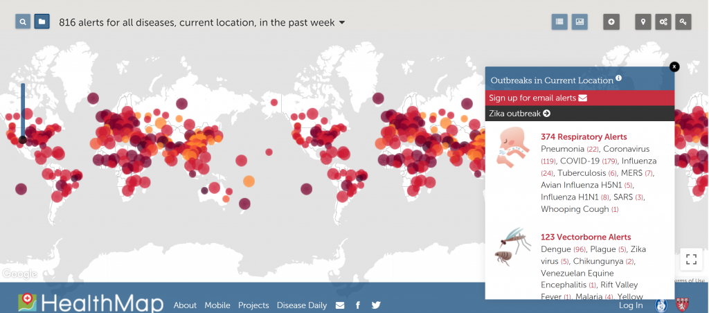
The first to react was the automated HealthMap system at Boston Children’s Hospital, which scans online news and social media reports for signals of spreading disease. Its warning was very quick and accurate (pneumonia cases in Wuhan) – raised at 11:12PM local time on December 30, but it did not assign significance high enough to the message.
The second report came from a human. Marjorie Pollack from the Program for Monitoring Emerging Diseases (ProMed) has based on similar social media reports received about 4 hours before the HealthMap warning. ProMed team’s analysis was more detailed than the first warning from AI but came about half an hour later.

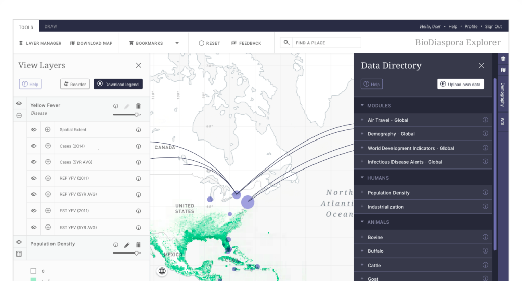
The third and most publicized report came from another AI-based model called BlueDot. BlueDot first became aware of the pneumonia cases in Wuhan on December 31st, and in addition to notifying their clients and government stakeholders directly, they publicly released their findings in the Journal of Travel Medicine on January 14th. While it was not truly the fastest, it is worth hearing how Kamran Khan, a Canadian MD, and founder of BlueDot explains the process behind.
Big Data Visualization to track Coronavirus COVID-19 (NCov-2019)
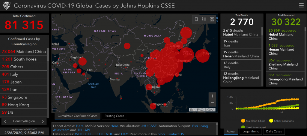
Dashboards showing the number of infected people, geographical spread and trends of the disease are useful to HCPs but also journalists and the public. This use case, although unfortunate, shows how important it is to be able to see and not only read data.

The first and most known dashboard came from the team at Johns Hopkins University. The dashboard, first shared publicly on Jan 22, illustrates the location and number of confirmed COVID-19 cases, deaths, and recoveries for all affected countries. It has been accompanied by an article in The Lancet.
Currently, there are multiple dashboards showing diverse aspects of the epidemic of COVID-19. The list of dashboards with working links can be found at ESRI website.
Coronavirus virally spreads a game for people want to know
Due to the virus business slows down. Except for Ndemic Creations, a studio that in 2012 developed Plague Inc. A game that simulates a viral epidemic.
Plague Inc. is a game, but it is based on science and realistically shows the spread of viral infections amongst the human population. In the game, the player is supposed to infect all humans before the cure is available. It is so successful in teaching about epidemiology, that it has been endorsed by the CDC. During the COVID-19 outbreak, it has reached the top of charts on the Apple Store. According to its developers, similar peaks in popularity have accompanied the Ebola outbreak in Africa in 2014-2016.
